ClockIt
A LGBTQ+ translation app focusing on queer terminology.
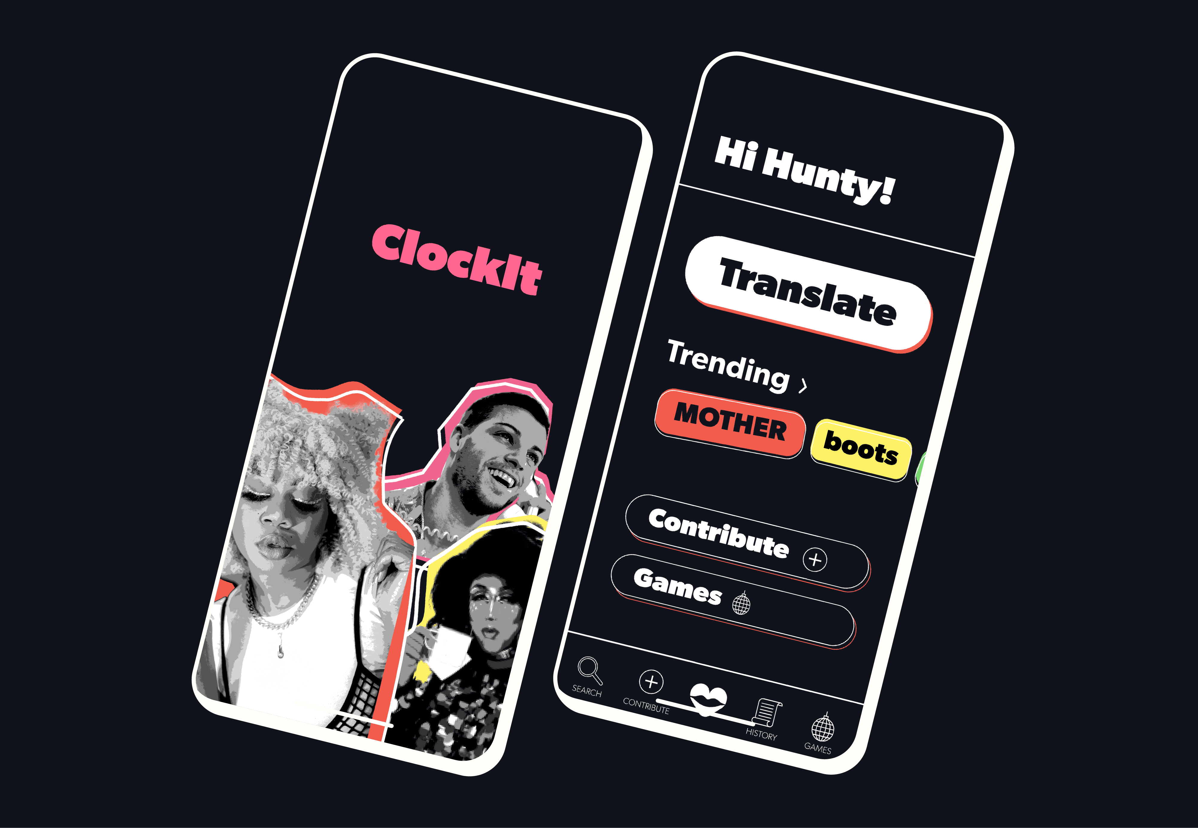
ClockIt is a mobile centered around queer terms to provide context to queer language and culture. That awkward moment when you don't understand a word of what your friends are saying when you speak the same language. In a generation with rapidly changing slang, terms and phrases, ClockIt provides definitions, translations, and historical context to keep you in the know for conversation with anyone who is queer, queer questioning, or an ally.
Client:
enter.stage
My Role:
Digital Designer
Year:
2025
Service Provided:
UX/UI Design
User Tasks
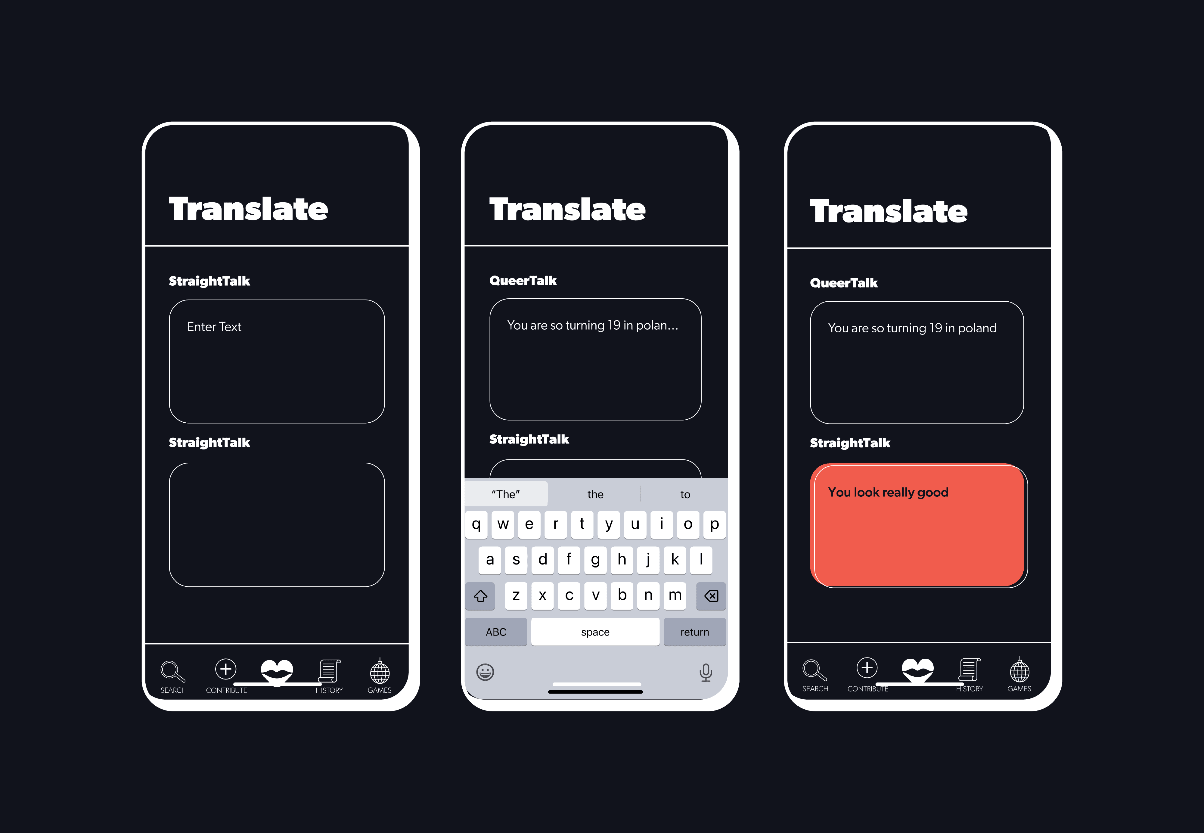
Translate a word/phrase. Users can instantly translate something they heard or read and get an accurate interpretation of it.
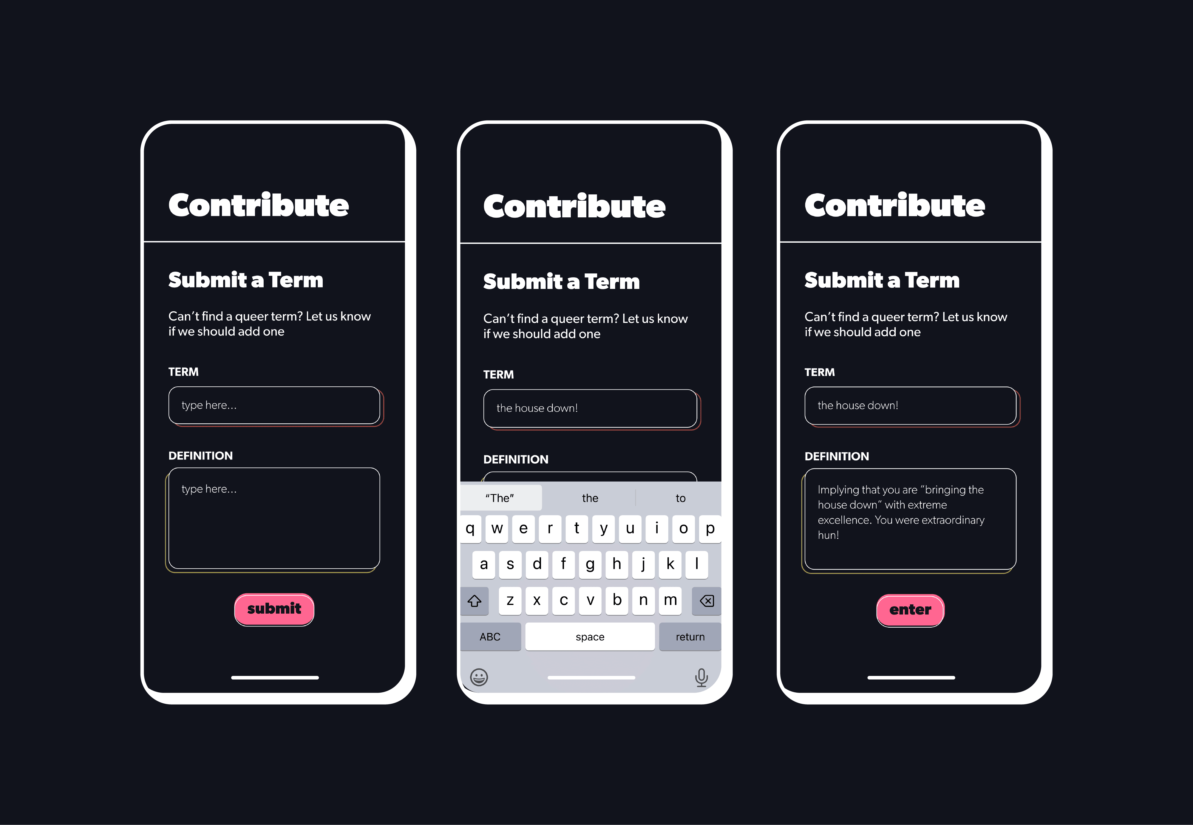
Contribute/Suggest a term or phrase. As queer language is constantly adapting, ClockIt allows users to suggest new terminology to be added to the dictionary.
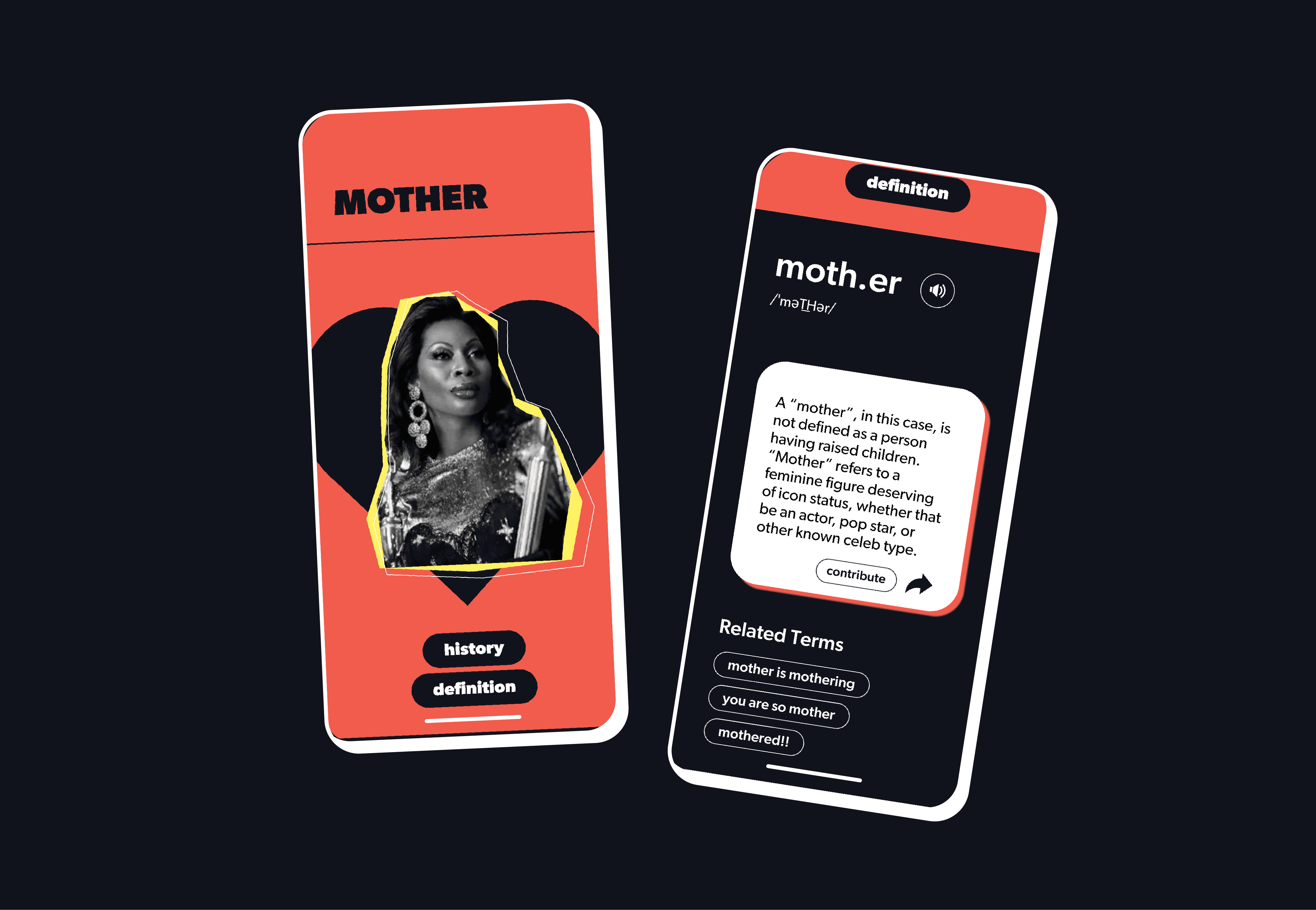
Historical Context+Definition. This allows users to get a deeper knowledge on the phrases they are interested in knowing.
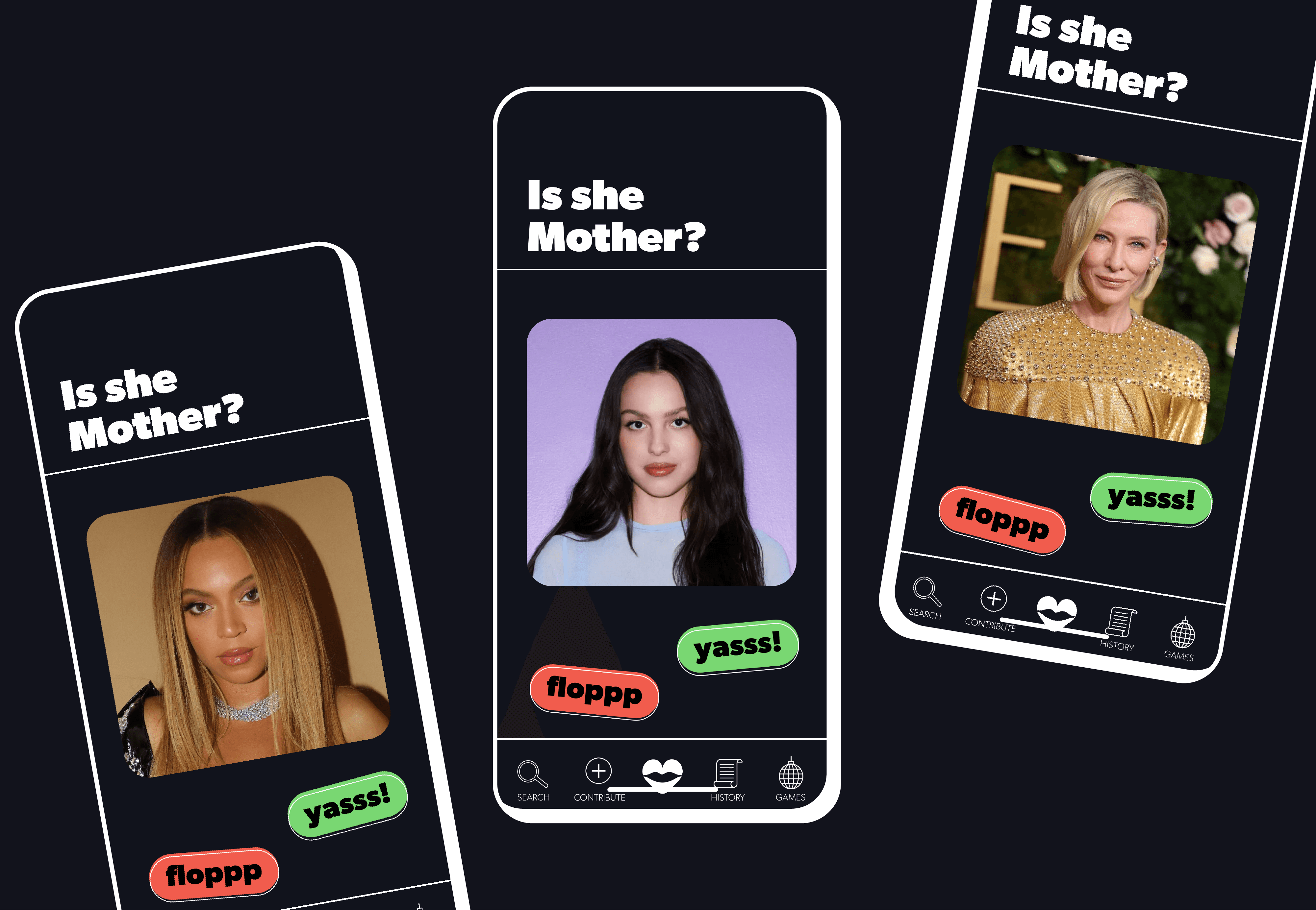
Bonus. An interactive mini-game swiping left or right on wether a pop icon is a "yay" or a "nay"

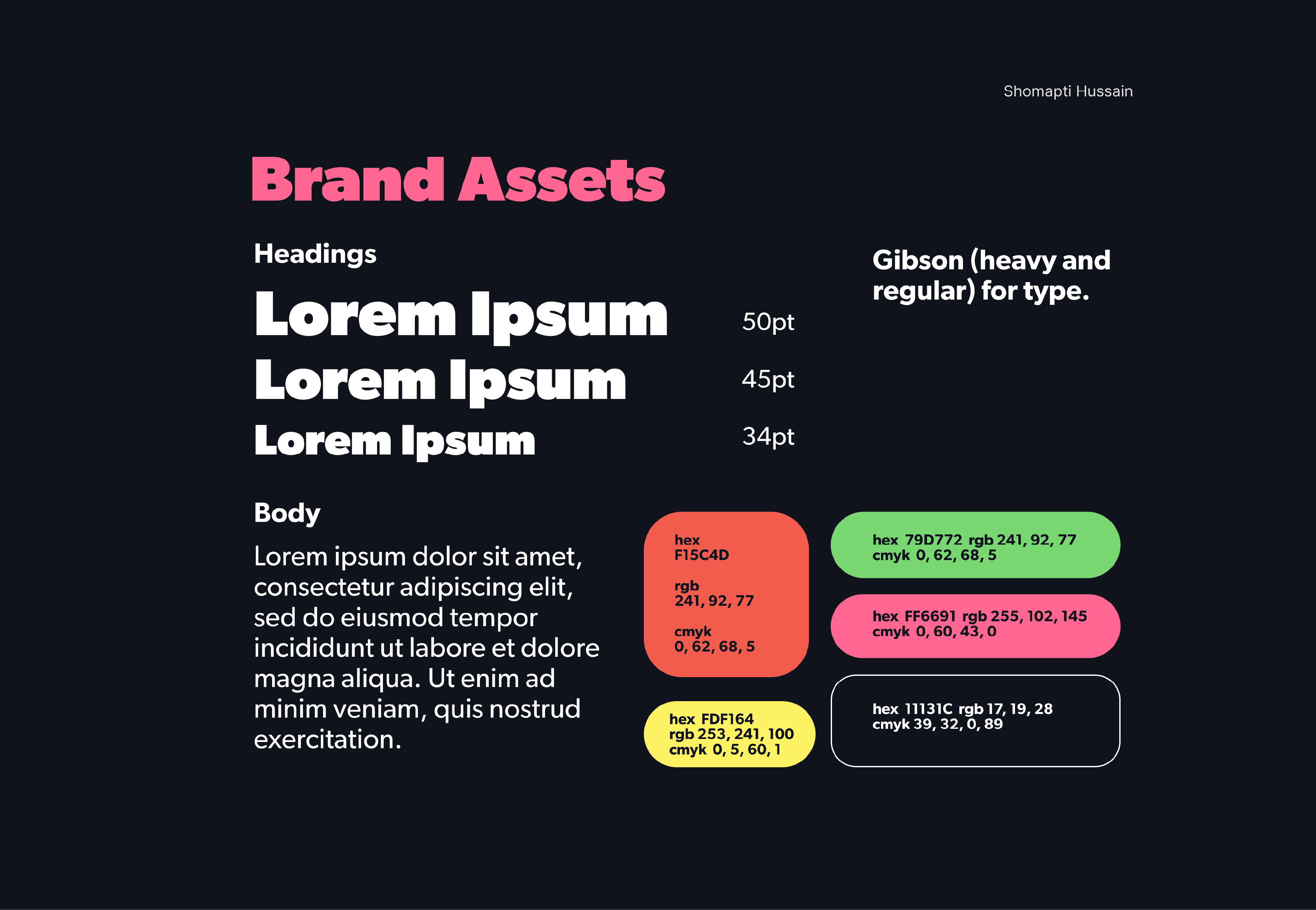
Brand Identity
ClockIt’s brand revolves around the usage of vivid colors, resembling the rainbow pride associated with LGBTQ+. Offset white outlines are consistent to further emphasize UI buttons and imagery while maintaining the vivaciousness, rhythm and movement of Queer life.